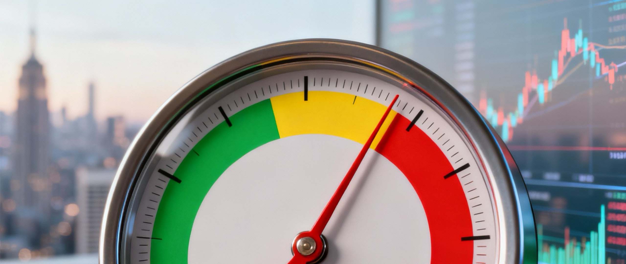
When the Buffett Indicator hits 222%, it sets off alarm bells for a reason. But is the Buffett Indicator at 222% a crash signal? While it's a powerful warning, it's not a crystal ball predicting an imminent crash. It's more like a flashing warning light on your dashboard—it doesn’t mean the engine will blow up in the next five minutes, but it’s telling you to pay serious attention and check under the hood.
Understanding The Buffett Indicator at 222%
So, what does a 222% reading actually mean? To understand why it's causing such a stir, you have to break down what the metric is actually measuring.
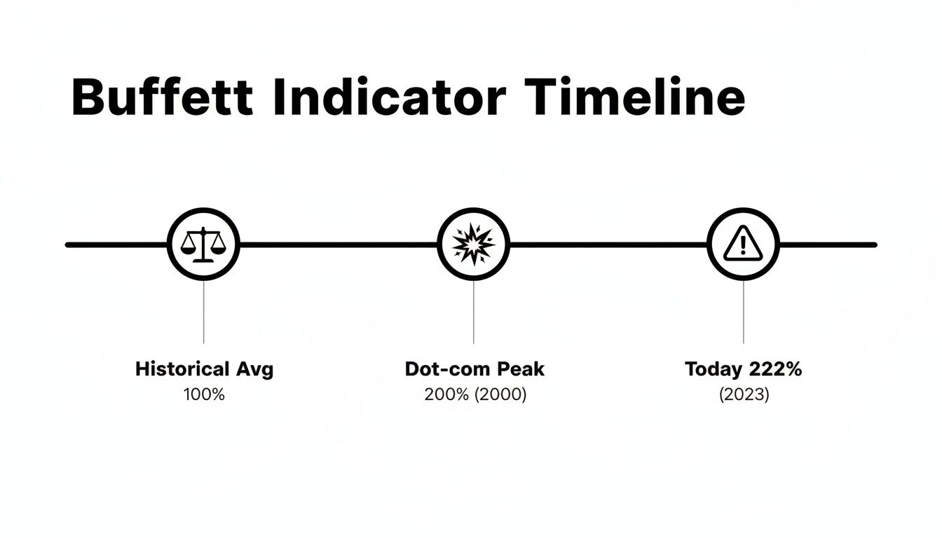
Think of the entire U.S. stock market as one giant company. The total value of all its shares—its market capitalization—is the company’s price tag. Then, you have the country's Gross Domestic Product (GDP), which is like the nation's total annual income. The Buffett Indicator simply compares the price tag to the income. A reading of 100% means the market is valued exactly the same as the country's entire economic output for a year, a level most analysts would consider fair.
At 222%, the market’s price tag is more than double the nation’s yearly economic engine. This suggests that stock prices have completely detached from the real-world economic activity that should be supporting them. It's a valuation stretch that demands every investor's attention.
Putting the 222% Level in Context
This isn't just a little high; it's a massive departure from anything we've seen before. Even at the peak of the dot-com bubble in 2000, a period now infamous for its speculative mania, the indicator only topped out around 140%. Today's level absolutely dwarfs that previous record, putting us in completely uncharted territory.
The indicator, made famous by Warren Buffett himself, hit a staggering 189.6% back in February 2021 during what many called the 'everything bubble.' Buffett famously warned that crossing 200% was "playing with fire." Well, here we are. You can explore insights on the Buffett Indicator at Wikipedia for more historical data on this valuation metric.
A Visual Guide to Market Valuation
To really see how unusual today’s environment is, a simple table can put things in perspective. It provides a quick snapshot comparing the current 222% reading with historical norms and past danger zones.
For investors who like to use multiple valuation tools to get a complete picture, you might also be interested in our guide on what the Shiller PE Ratio is and how to use it.
Buffett Indicator Levels and Market Outlook
This table provides a quick reference for interpreting different levels of the Buffett Indicator, from undervalued to the current extreme overvaluation.
The stark contrast here lays out the central question for every investor: Is this extreme reading a prelude to a painful correction, or have the rules of the game changed in a way that somehow justifies these levels? The next sections will dig into that question by looking at what happened in the past, what the counterarguments are, and what you can actually do about it in your portfolio.
What History Tells Us About Market Peaks
History rarely repeats itself exactly, but it often rhymes. While the Buffett Indicator isn't a magical crystal ball for timing a crash, its track record is worth paying attention to. When it screams this loud, it's usually for a good reason.
Looking back, extreme readings have almost always preceded periods of major market pain. By digging into what happened during past peaks, we can get a much better feel for the risks baked into today's 222% level. Two clear examples come to mind: the dot-com bubble in 2000 and the financial crisis in 2008. In both cases, the indicator flashed red long before the panic set in, warning that valuations had completely disconnected from economic reality.
The Dot-Com Implosion (2000)
Remember the late 90s? It was a wild time of pure speculation, fueled by the idea that the internet would rewrite the rules of business. Valuations for tech companies, even those with zero profits, shot into the stratosphere. That speculative fever pulled the entire market up to dangerous heights.
At its peak in March 2000, the Buffett Indicator hit 136.9%. While that seems tame compared to today, it was a record at the time. What followed was a bloodbath. The Nasdaq cratered 78% between 2000 and 2002, and the broader market collapse wiped out over $7 trillion in wealth as the tech fantasy evaporated.
This chart puts it in stark perspective. Today's 222% reading isn't just a little higher than the dot-com peak—it's in a completely different league. We're in uncharted territory.
The Global Financial Crisis (2008)
Fast forward a few years to 2007. This time, the bubble wasn't in dot-com stocks but in the housing market, supercharged by complex and poorly understood financial derivatives. The Buffett Indicator clocked in at 105.2% just before the crisis hit.
While that reading was lower than the 2000 peak, it was still well into what Buffett would call "significantly overvalued" territory. The key lesson here is that market excess can hide in plain sight. The indicator signaled the general overvaluation, but nobody knew the specific trigger would be the collapse of the subprime mortgage market.
The fallout was catastrophic. The S&P 500 was cut in half, dragging the entire global economy into a brutal recession and erasing $11 trillion in market value. It was a painful reminder that a high valuation doesn't tell you what will pop the bubble, just that a bubble exists and is ready to be popped.
If you want to take a deeper dive into market downturns, we cover the history of stock market crashes in another article.
What We Can Learn from These Crashes
So, is the Buffett Indicator at 222% a crash signal? Looking at these past events, a clear picture emerges.
- It's a Condition, Not a Catalyst. A high reading means the market is vulnerable, like a forest in a drought. It's a tinderbox. The indicator doesn't predict the lightning strike that starts the fire.
- Timing is Everything (and Impossible). In both 2000 and 2008, the market stayed overvalued for months, even years, before the real correction started. Selling too early means leaving huge gains on the table.
- The Reversion Is Painful. When markets finally do correct from these extreme highs, the trip down is fast and brutal. The higher the peak, the harder the fall.
These lessons frame today's 222% reading not as a guarantee of an immediate crash, but as a loud warning that the market's margin for error is razor-thin. The risk of a major drawdown is dangerously elevated, and that demands a much more cautious and strategic approach from investors.
Arguments For Why This Time Could Be Different
While a 222% Buffett Indicator reading is a historically potent warning, it's a mistake to look at that number in a vacuum. A purely bearish outlook ignores powerful economic forces that have reshaped the entire investment landscape. Before sounding the alarm, we have to consider the compelling arguments for why today's high valuations might just be more sustainable than they were in past cycles.
One of the biggest factors propping up the market has been the prolonged era of rock-bottom interest rates. For much of the last decade, investors have been living in a world of TINA, or "There Is No Alternative." When safe-haven assets like government bonds and savings accounts offer returns that barely beat inflation (if at all), where else is there to put your money for growth?
This pushes investors further out on the risk spectrum, and that massive flow of capital has one primary destination: the stock market. Think of it like water seeking its own level. With the reservoir of safe returns nearly empty, trillions of dollars that might have traditionally gone into bonds have instead flooded into equities, bidding up prices across the board. This dynamic fundamentally alters the valuation equation, making stocks look far more attractive by comparison and potentially justifying higher multiples.
The Globalization Factor
Another major wrinkle in applying the old Buffett Indicator formula to today's economy is globalization. The indicator’s classic formula compares the value of U.S. companies (their total market cap) to U.S. economic output (GDP). But that comparison gets seriously distorted when a huge chunk of corporate earnings comes from outside the United States.
Many of the largest companies in the S&P 500 are global behemoths. Tech and consumer giants, for instance, often earn 40% or more of their total revenue from international markets.
These foreign earnings directly boost a company's stock price and, by extension, its market capitalization. The problem is, they are not counted in the U.S. GDP. This creates a structural mismatch where the numerator of the formula (market cap) is inflated by global activity, while the denominator (GDP) remains purely domestic.
This globalization effect means the indicator may be permanently biased upwards compared to previous eras when the U.S. economy was far more self-contained.
Shifts in Corporate Profitability and Composition
The very nature of the stock market has also changed. Today’s market leaders are asset-light, high-margin technology and service companies—a world away from the capital-intensive industrial giants that dominated the 20th century.
These modern companies are simply far more profitable, converting a much higher percentage of their revenue into cold, hard earnings. This enhanced profitability can naturally support higher valuations. Several key shifts are at play here:
- Higher Margins: Tech and software companies run on lean models with significantly higher profit margins than traditional manufacturing or industrial firms.
- Share Buybacks: Corporations have funneled trillions of dollars into buying back their own stock. This reduces the number of outstanding shares, which juices earnings-per-share (EPS) and helps support higher stock prices.
- Intangible Assets: Value today is driven more by intellectual property, brand recognition, and network effects than by physical factories and machinery.
These are not cyclical trends; they are structural changes in how the economy works. While the question "Is the Buffett Indicator at 222% a crash signal?" remains critical, these counterarguments show that a direct, apples-to-apples comparison with historical peaks might be a dangerous oversimplification.
A Powerful Gauge, Not a Perfect Prophet
While a reading north of 200% certainly signals a frothy market, it's a huge mistake to treat the Buffett Indicator as some kind of standalone crash predictor. No single metric can possibly wrangle the complexities of the modern global economy, and this one's no exception. Think of it as a broad-gauge thermometer for market temperature—it tells you if things are hot, but not the exact moment the fever will break.
To use it wisely, you have to appreciate its blind spots. One of the biggest is how it handles interest rates. For the better part of a decade, near-zero rates made bonds and cash look terrible. Where did all that money go? Into stocks, naturally pushing valuations skyward. The indicator doesn't adjust for that.
It also struggles with huge structural shifts in the economy. The rise of asset-light, high-margin giants like big tech means corporate profits can now grow much faster than the overall economy. This fundamentally alters the old relationship between market value and GDP, arguably justifying a higher baseline reading than we saw in past decades.
Simple, But Maybe Too Simple
The indicator’s formula is elegant in its simplicity, but that’s both a strength and a weakness. It doesn't see evolving corporate profit margins, the massive impact of stock buybacks, or the tangled web of global capital flows.
Because of these limitations, a market can stay "overvalued" for years, making fools out of investors who jump the gun based on this signal alone. The historical record is crystal clear on this: the indicator has stayed above 120% since the third quarter of 2016. That’s a long, frustrating stretch of "expensive" that has tested its short-term predictive power.
As many have pointed out in recent market analysis, this persistence isn't magic. In 2021, 10-year Treasury yields scraped rock bottom at 0.5%, a world away from the 6% seen in 2000. That kind of environment fundamentally changes the math for investors, making stocks feel like the only game in town. You can discover more insights about market crash predictions and their complexities to really grasp this dynamic.
Key Flaws to Remember
Getting this right means keeping the indicator's main weaknesses front and center. It’s an incredibly useful tool, but only as part of a much broader dashboard, never as a lone prophecy.
- Ignores Interest Rates: The indicator has no context for the cost of money. A high valuation is far more sustainable when rates are at 1% than when they're at 5%.
- Globalization Distortion: It pits a globalized stock market (where companies earn billions overseas) against a purely domestic economic figure (U.S. GDP). It's an apples-to-oranges comparison that gets worse every year.
- Doesn't See Profit Margins: The modern market is dominated by high-margin tech and service businesses. It's just a structurally more profitable machine than it was 40 years ago, which can naturally support higher valuations.
- A Terrible Timing Tool: This is the big one. The indicator can scream "overvalued" for years before a correction hits, making it almost useless for trying to time the top.
The core takeaway is this: The Buffett Indicator is excellent at telling you the condition of the market (is it expensive or cheap?), but it's terrible at predicting the timing of a correction. Answering the question, "Is the Buffett Indicator at 222% a crash signal?" demands looking far beyond this one number and taking in the entire economic landscape.
How to Strategically Adjust Your Portfolio Now
When an indicator like the Buffett Indicator starts flashing red at 222%, the worst thing you can do is panic. The second-worst? Do nothing at all.
This isn't a signal to dump your stocks and stuff cash under the mattress. It is, however, a powerful nudge to get proactive about risk. For high-net-worth investors, it’s time to move beyond generic advice and start making specific, sophisticated adjustments to your portfolio.
The game isn't about timing the market perfectly—that's a fool's errand. It's about making sure your portfolio is resilient enough to handle a serious drawdown without derailing your entire financial plan. It all comes down to a deliberate, clear-eyed review of what you own, where your risks are, and whether your allocations still make sense.
Rebalancing with a Tactical Edge
Most people think of rebalancing as just selling winners to buy losers and get back to a target mix. But in a high-valuation world, it needs to be more tactical than that. This is a golden opportunity to trim positions in sectors that have become dangerously overextended—especially those where the price seems completely detached from reality.
That doesn't mean you abandon growth stocks entirely. It’s about managing concentration risk. If a handful of high-flying tech names now make up a huge piece of your portfolio, systematically taking some profits off the table locks in those gains and makes you less vulnerable if that specific sector hits a wall.
The core idea is simple: Shift from a portfolio driven by pure momentum to one grounded in sound valuation. This kind of proactive trimming puts you back in control, preventing a sudden market reversal from dictating your returns.
Diversifying Beyond Traditional Assets
Real diversification means owning things that don't all sink together in a crisis. When both stocks and bonds are historically expensive, you have to look further afield for assets that have a low correlation to public markets.
It's time to think about adding some non-traditional asset classes:
- Private Credit: Lending directly to companies can generate attractive, steady income streams that are largely insulated from the day-to-day chaos of the stock market.
- Real Estate: Directly owning income-producing properties or investing in private real estate funds can provide stable cash flow and a solid hedge against inflation.
- Managed Futures: These strategies are built to profit from market trends, whether they're going up or down. That can provide a powerful counterbalance when your equities are taking a beating.
If you're looking to explore different ways to build a more durable portfolio, digging into asset allocation strategies for a volatile market is a great place to start.
When valuations are this stretched, it’s essential to have a clear plan. Here’s a breakdown of some practical steps high-net-worth investors can take to fortify their portfolios.
Actionable Strategies for a High-Valuation Environment
These strategies aren't about making a single, dramatic move. They are about making a series of smart, incremental adjustments to build a more resilient financial foundation.
Enhancing Portfolio Efficiency with Tax-Aware Strategies
A high-valuation market is the perfect time to get serious about tax efficiency. Smart tax management can add significant value, particularly when you’re bracing for potential volatility.
A key move here is tax-loss harvesting. It sounds complicated, but the idea is straightforward: sell investments that are down to "harvest" a capital loss. You can then use those losses to offset the capital gains you realized from rebalancing your winners, cutting your overall tax bill. This strategy gives you the freedom to reposition your portfolio without taking a big tax hit.
The Importance of Portfolio Stress Testing
How would your portfolio hold up in a repeat of the 2008 financial crisis? Or the 2000 dot-com bust? If you don’t know the answer, it's time to find out. Stress testing is the process of running your portfolio through different historical and hypothetical downturns to see exactly how much you stand to lose.
The point isn't to scare yourself—it's to understand where your specific vulnerabilities lie. A stress test might show that your "diversified" portfolio is far more tied to the S&P 500 than you thought, or that your income stream would dry up in a bad recession. This analysis gives you the hard data you need to make informed changes, like adding specific hedges or boosting your cash reserves, before a crisis hits. For anyone wanting personalized guidance on these kinds of adjustments, consulting with experienced financial advisors is a smart next step.
The Final Verdict: A Warning Signal, Not a Crystal Ball
So, after digging through the history, the modern market quirks, and what it all means for your portfolio, we can finally get to the heart of the matter. Is the Buffett Indicator at 222% a crash signal?
The short answer is no—at least, not in the way a fortune teller predicts the future. It can’t give you a date and time for when things might unravel.
But what it is, without a doubt, is a historically significant warning flare. An indicator this high signals a market stretched taut, like a rubber band pulled to its absolute limit. It doesn’t tell you the exact moment it will snap, but it confirms the tension is dangerously high and the margin for error has all but vanished.
Putting the Pieces Together
We've seen how the indicator has its flaws. It struggles to account for globalization and has been thrown off by years of rock-bottom interest rates. But its track record of flagging major corrections is hard to ignore.
Consider this: the peaks right before the 2000 dot-com bust and the 2008 financial crisis were significantly lower than where we are today. That alone should command respect. At the same time, we know powerful economic forces have arguably justified higher valuations for a long time.
This leaves investors in a tough spot. It’s a situation that demands a more sophisticated approach, one that avoids two classic mistakes: panic-selling based on a single number, and staying fully invested out of a fear of missing out. The right path is somewhere in the middle—a strategy built on disciplined, proactive risk management.
The Buffett Indicator isn’t telling you to jump out of the plane. It’s a loud, clear reminder to check your parachute, review your emergency procedures, and ensure you are fully prepared for turbulence.
A Call for Strategic Caution
Ultimately, navigating a market like this requires a cool head and a clear plan. The indicator’s message isn’t one of doom, but one of diligence. It’s a powerful call to rebalance your portfolio, stress-test your holdings, and make sure your financial plan is resilient enough to withstand a real shock.
Making sound choices when valuations are this stretched is critical. To better navigate these signals, it can be helpful to explore different decision-making frameworks to guide your strategic adjustments. By choosing a data-driven strategy over an emotional reaction, you put yourself in a position to not just survive a potential downturn, but to capitalize on the opportunities that will inevitably emerge from it.
Even after getting the big picture on the Buffett Indicator, it’s only natural to have a few lingering questions. Let's dig into some of the most common ones and what a 222% reading really means for your money.
What’s a “Normal” Level for the Buffett Indicator, Anyway?
You can think of a 75% to 90% reading as the historical sweet spot. In that zone, the stock market's total worth is more or less aligned with the country's economic horsepower (GDP), suggesting things are on a sustainable footing.
When the indicator dips below 75%, it can signal that the market is undervalued—historically a great time for long-term investors to find bargains. On the flip side, a reading between 90% and 115% starts to look a bit pricey, and anything above 115% is flashing a warning sign of significant overvaluation, often leading to lower returns down the road.
How Is This Different From Something Like a P/E Ratio?
The Buffett Indicator is a top-down, bird's-eye view of the entire market landscape. It’s like looking at the forest. The Price-to-Earnings (P/E) ratio, however, is a bottom-up metric that gets you down to the individual trees, measuring a single company's stock price against its profits.
While both are trying to answer the question "Is this expensive?", they come at it from completely different angles. The Buffett Indicator gives you the broad economic backdrop, while a P/E ratio zooms in on a specific company's earnings power. Most advisors use them together. When a sky-high Buffett Indicator is echoed by equally lofty P/E ratios across the board, the case for being cautious gets a lot stronger.
Should Long-Term Investors Just Ignore This Warning?
Absolutely not. You shouldn't ignore it, but you definitely shouldn't panic either. A high Buffett Indicator isn't a fire alarm telling you to sell everything. Think of it more as a friendly but firm reminder to check your portfolio's defenses.
Now is the time to reinforce your strategy, not abandon it. This means taking practical steps:
- Rebalance your portfolio. Trim back some of the winners that have grown into an outsized part of your holdings.
- Double-check your diversification. Are you truly spread across different asset classes, industries, and geographies?
- Keep some cash on hand. Maintaining some liquidity gives you the firepower to buy quality assets if and when they go on sale during a downturn.
So, is the Buffett Indicator at 222% a crash signal? It's less of a prediction and more of a call to prepare. It’s a signal to make sure your financial house is in order and that your portfolio is built for whatever the market throws at it.
At Commons Capital, we help high-net-worth individuals and families navigate these kinds of complex market environments with a steady hand. If you're looking for a disciplined approach to wealth management, we invite you to learn more about our services.