
The Shiller PE ratio is one of the most powerful tools in an investor's kit for gauging whether the stock market is running hot or cold. By looking at inflation-adjusted earnings over the past decade, it smooths out the chaotic ups and downs of the business cycle. This gives you a much clearer, more reliable picture of market value than the standard P/E ratio, making it indispensable for smart, long-term strategic decisions.
Understanding the Shiller P/E Ratio: A Better Market Lens
When investors want a quick read on the market, they usually grab the standard Price-to-Earnings (P/E) ratio. It’s a handy starting point, but it has a huge blind spot: it only looks at the last 12 months of earnings. A single year of blowout profits or a sudden crash can make the market seem way cheaper or more expensive than it really is.
Think of it like trying to understand a movie by looking at a single, isolated frame. That’s the standard P/E—just a snapshot. The Shiller P/E, on the other hand, is like watching the whole scene unfold. It provides context, depth, and a far more honest story about the market’s true valuation.
A More Stable Valuation Metric
Developed by Nobel laureate economist Robert Shiller, the Cyclically Adjusted Price-to-Earnings (CAPE) ratio—now widely known as the Shiller P/E—was built to fix this short-term thinking. Instead of one year of earnings, it divides the current market price by the average of the last ten years of inflation-adjusted earnings.
That 10-year window is the magic ingredient. It’s long enough to capture an entire economic cycle, smoothing out the boom-and-bust periods that can send corporate profits on a wild ride.
For instance, during the 2007-2009 financial crisis, plunging corporate profits sent the traditional P/E ratio screaming past 100. It made the market look absurdly overpriced right when it was hitting a generational bottom. The CAPE ratio, however, stayed grounded, offering a much more rational assessment of the situation. You can discover more insights about the CAPE ratio and its development directly from the source.
The Shiller P/E provides a sober, long-term perspective on market valuations, helping investors see past the temporary noise of economic cycles and focus on fundamental value.
Comparing Valuation Lenses
To really get a feel for what the Shiller PE ratio is and how to use it, let's put it head-to-head with its traditional counterpart. As you'll see, each one gives you a very different piece of information.
Shiller PE vs Standard PE at a Glance
This table cuts straight to the core differences, showing why one gives you a fleeting glimpse while the other offers a panoramic view.
By understanding these distinctions, it becomes clear why the Shiller P/E serves as a more reliable anchor for building long-term investment strategies and managing risk over time. It helps you tune out the market's daily chatter and focus on the bigger picture.
Breaking Down the Shiller PE Ratio Calculation
While the theory behind the Shiller P/E is powerful, its real appeal is how refreshingly simple the calculation is. When you see what goes into the number, it stops being some abstract academic metric and becomes a practical tool you can actually use.
Unlike some of the black-box models out there, the CAPE ratio follows a clean, three-step logic. It all boils down to one straightforward formula.
Shiller P/E Ratio = Real (Inflation-Adjusted) Market Price / 10-Year Average of Real (Inflation-Adjusted) Earnings
This process is designed to filter out the short-term market noise, giving you that clear, cyclically-adjusted view we've been talking about. Let's walk through exactly how that number comes to life.
The Three Core Steps
Putting the CAPE ratio together just means grabbing a few specific data points and doing some simple math. The whole point is to compare today's price against a much more stable, long-term earnings baseline.
- Gather a Decade of Earnings Data: First, you collect the reported earnings for a broad market index, like the S&P 500, for each of the last 10 years. This is the historical bedrock of the entire metric.
- Adjust for Inflation: This step is critical. You take each of those 10 years of earnings and adjust them for inflation to see what they’re worth in today's dollars. It ensures you’re making an apples-to-apples comparison, preventing older earnings from looking artificially small.
- Calculate the 10-Year Average: With all 10 years of earnings restated in today's dollars, you just find the average. This single number represents the smoothed-out, normalized earnings power of the market over a full business cycle.
The final step is to take the current price of the S&P 500 and divide it by that 10-year average. The result is the Shiller P/E ratio—a single figure that tells you how expensive the market is relative to its own normalized history. Getting a handle on this helps put other valuation methods into context, and it's worth understanding the broader principles of how to value stocks to see where it fits in.
A Simplified Example in Action
Let’s run through a quick hypothetical to make this tangible. Imagine the S&P 500 is currently trading at 4,000.
- First, we’d gather the last 10 years of earnings and adjust each one for inflation.
- Let’s say that after doing the math, we find the average of these inflation-adjusted earnings is $125 per share.
- Now, we do the final, simple division:
Current Price ($4,000) / 10-Year Average Earnings ($125) = 32
In this scenario, the Shiller P/E ratio is 32. This tells us the market is trading at 32 times its average inflation-adjusted earnings over the past decade.
So, what does that 32 mean? We can compare it to the long-term historical average for the CAPE ratio, which has hovered around 17. This quick check suggests the market looks pretty expensive, giving us a powerful, data-driven starting point for deeper strategic conversations.
What Market History Teaches Us Through the Shiller PE
To really get a feel for what the Shiller PE ratio is and how to use it, you have to look back at its track record. Market history isn't just a boring collection of dates and numbers; it's a series of dramatic stories about human emotion—from irrational exuberance to painful, gut-wrenching corrections. Through it all, the CAPE ratio has often acted like a barometer, signaling pressure changes long before the storm actually hit.
By examining how it behaved during the market’s biggest meltdowns and manias, we can see how this one metric provides a crucial long-term perspective that the day-to-day noise often drowns out. The historical context is really what makes its value so compelling.
This chart tracks the Shiller P/E for the S&P 500 over more than a century, showing exactly how it has moved during major market events.
The peaks and valleys on this graph line up almost perfectly with some of the most famous bubbles and crashes in financial history. It’s a powerful visual of just how effective it can be as a valuation signal.
The Dot-Com Bubble: A Warning Ignored
The late 1990s was a period of pure, unadulterated optimism. The internet was changing everything, and investors, completely caught up in the frenzy, sent tech stock valuations into the stratosphere. While most people were celebrating the dawn of a "new economy," the Shiller P/E was quietly screaming a warning.
In December 1999, the CAPE ratio shot up to its all-time high of over 44—more than double its historical average. That number was a clear signal that market prices were stretched to a breaking point relative to a full decade of real, inflation-adjusted earnings.
What happened next was, in hindsight, completely predictable. The NASDAQ, which had climbed fivefold between 1995 and 2000, came crashing down by nearly 80% over the next two years. Investors who ignored the CAPE’s warning learned a tough lesson about the difference between price and value. That period is still the ultimate case study for anyone trying to understand the real dangers of a stock market bubble.
Precursor to the Great Financial Crisis
It didn't take long for history to repeat itself. Less than a decade later, a housing boom fueled by easy credit and risky lending created another wave of market euphoria. By mid-2007, the Shiller P/E had once again crept into dangerous territory, peaking above 27.
While this wasn’t as extreme as the dot-com peak, it was still far above the historical norm. It was another sign that valuations were becoming unmoored from their fundamental earnings foundation. When the housing market finally imploded, it kicked off a global financial crisis, and the S&P 500 plunged by more than 50%. Again, the high CAPE reading was a prescient signal of just how much risk had built up in the system.
There have only been a few times in the last 140 years when the Shiller PE got this high—and most have ended in major crashes. This doesn’t mean we can time the market. But it does mean we need to be sober and strategic.
Signaling Generational Buying Opportunities
But the Shiller P/E isn't just a doomsday indicator. It's just as powerful at identifying moments of incredible opportunity. The signal works both ways, highlighting times when widespread fear has pushed prices to irrationally low levels.
- The Early 1980s: After a brutal decade of high inflation and economic stagnation, market sentiment was in the gutter. In 1982, the CAPE ratio sank to a single-digit low below 7. This was a screaming buy signal that stocks were historically cheap. For the brave investors who bought in, the timing was perfect—it marked the very beginning of one of the greatest bull markets in history.
- The 2009 Bottom: Fast forward to the depths of the Great Financial Crisis. As pure panic gripped the markets, the CAPE ratio plunged to 13.3 in March 2009. While most investors were dumping stocks, the metric suggested that valuations had become extremely attractive. This turned out to be another generational buying opportunity, kicking off a bull run that lasted more than a decade.
These historical examples don't prove the Shiller P/E is a crystal ball for market timing. A high CAPE can stay high for years, and a low one doesn't mean stocks will rebound tomorrow. What its track record does provide, however, is an undeniable lesson: the CAPE ratio is an essential strategic guide for assessing long-term risk and return potential.
Using The Shiller PE To Forecast Long-Term Returns
Looking back at history is one thing, but the real magic of the Shiller P/E ratio is how it helps us peer into the future. This is where the metric stops being an academic curiosity and becomes a powerful tool for investors, helping us set realistic expectations and guide our long-term strategy. It gives us a data-driven way to answer the million-dollar question: what can we really expect from the stock market over the next decade?
The connection is surprisingly straightforward. History shows a strong, consistent inverse relationship between the CAPE ratio and the market's performance over the following 10 years. Simply put, when the CAPE is high, future returns tend to be disappointing. When it's low, the decade ahead often looks much brighter.
Introducing The CAPE Yield
A quick and surprisingly effective way to turn the Shiller P/E into an expected return is to calculate its inverse, what we call the CAPE Yield.
CAPE Yield = 1 / Shiller P/E Ratio
Think of this as a back-of-the-napkin estimate for the annualized real (after-inflation) return you might expect from stocks over the coming 10 years. For example, if the Shiller P/E is sitting at 33, the CAPE yield is roughly 3% (1 / 33). This simple math helps ground your return expectations in data, not just market hype.
The chart below paints a clear picture of the Shiller PE’s wild ride through history, showing how it spiked just before major market meltdowns like the 1929 Crash, the 1999 Dot-com Bubble, and the 2008 Financial Crisis.
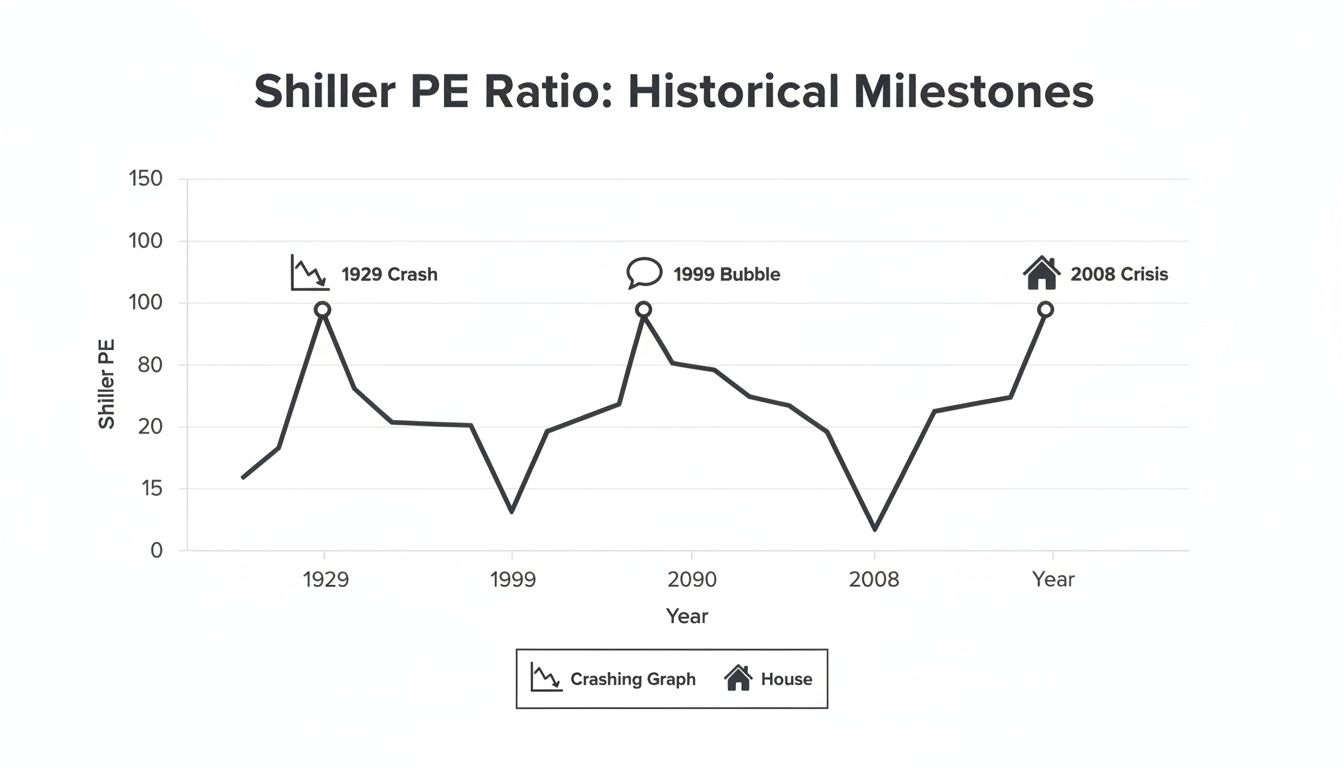
As you can see, sky-high CAPE readings have almost always come before periods of lackluster, or even negative, market performance. This track record is what makes it such a valuable long-term forecasting tool.
Connecting Valuations To Future Performance
Why does this work? The Shiller PE's predictive power hinges on the old market principle of mean reversion—the tendency for extreme valuations to eventually drift back toward their historical average. This is a core concept behind many mean reversion strategies. While it's useless for timing the market day-to-day, its ability to forecast returns over a 10-year horizon is backed by more than a century of data.
To see just how well it has worked in the past, take a look at the table below. It shows the CAPE ratio at the start of several decades and the actual real returns investors experienced over the subsequent 10 years.
Historical CAPE Ratios and Subsequent 10-Year Returns
The pattern is hard to ignore. Low starting CAPE ratios in 1980 and 2010 were followed by fantastic returns. In contrast, the nosebleed valuation in 2000 led to a "lost decade" for investors.
Let's put a finer point on that 2000 example. When the CAPE ratio peaked near 44 in March 2000, the implied real return was practically zero. Sure enough, the decade that followed was a massive disappointment for stock investors, with the S&P 500 delivering a dismal -1.4% annualized real return from 2000 to 2010.
Key Takeaway: A high Shiller P/E doesn't tell you when a correction will hit. What it does suggest, quite strongly, is that the returns you can expect over the next 10 years are likely to be lower than average.
This is an invaluable dose of reality for any investor, especially when markets feel euphoric. It’s a good reminder to look at other leading economic indicators for the stock market to get a complete picture of the risks and opportunities ahead.
For high-net-worth individuals, this understanding is critical for making smart decisions about asset allocation. A stubbornly high CAPE might suggest it’s a good time to trim back on stocks or diversify into other assets with better long-term prospects. On the flip side, a very low CAPE can signal a generational buying opportunity. It helps shift the entire focus from chasing short-term fads to building a resilient portfolio based on realistic expectations.
Putting the Shiller P/E to Work in Your Portfolio
Knowing the Shiller P/E’s history and what it can tell us about the future is one thing. Actually using that insight to make smart decisions is a whole different ballgame. For a disciplined investor, this metric isn't just a number—it’s a strategic guidepost. It helps pull your focus away from the fool's errand of short-term market timing and toward long-term positioning, which is where real wealth is built and protected.
The trick is to use the CAPE ratio like a thermometer for the market, not an alarm bell telling you to panic-sell. When the market’s running hot, a high CAPE suggests it's time to be careful. When it’s cold, a low reading could be signaling a rare opportunity.
A Guide for Strategic Asset Allocation
One of the most practical ways to use the Shiller P/E is to inform your strategic asset allocation. This isn't about making wild, sudden moves. It’s about making gradual, thoughtful adjustments to your mix of stocks, bonds, and other assets based on what long-term valuations are telling you. Think of it as tilting your portfolio in a more defensive or opportunistic direction.
When the CAPE ratio climbs significantly above its historical average—say, into the high 20s or 30s—it’s a strong hint that future returns from stocks are likely to be pretty tame.
In that kind of environment, a prudent investor might:
- Rebalance with a Purpose: Gently trim your exposure to what looks like an overvalued stock market. For example, if your target for stocks is 60%, you might bring it down to 55% and shift that capital into assets that don't move in lockstep with the market, like high-quality bonds or real estate.
- Build Up Your "Dry Powder": Increasing your cash reserves isn't about hiding from risk; it’s about preparing for opportunity. This gives you the capital to deploy when valuations eventually become more attractive after a potential downturn.
- Diversify Beyond the Obvious: Start looking for assets that are less expensive or are driven by different economic factors. A high CAPE in the U.S. doesn't mean every market in the world is overheated.
This kind of thinking is central to building a truly resilient portfolio. For a deeper dive, check out our guide on asset allocation strategies for a volatile market, which lays out a clear framework for making these kinds of adjustments.
A Tool for Managing Risk
Beyond just allocation, the Shiller P/E is an exceptional tool for managing risk. Think of it as an early warning system. A high CAPE doesn’t tell you when a downturn will hit, but it does tell you that the potential downside is a lot bigger than usual.
The Shiller P/E doesn't tell you to time the market. It tells you to be sober and strategic when others are euphoric, and to be brave when others are fearful.
Armed with this insight, you can start taking steps to fortify your portfolio. That might mean reviewing the quality of your individual stocks, making sure you aren't too concentrated in the high-flying sectors of the day, or even stress-testing your financial plan to see how it would hold up in a long bear market. It helps you answer the most important question of all: "Is the potential reward I'm seeing really worth the visible risk?"
Spotting Relative Value Across the Globe
Finally, the Shiller P/E is incredibly useful for spotting relative value on a global scale. Just because the U.S. market looks expensive doesn't mean there aren't deals to be had elsewhere. By comparing the CAPE ratios of different countries, investors can uncover some seriously overlooked opportunities.
For instance, you might see periods where the CAPE for the S&P 500 is hovering near 30, while the CAPE for European or emerging markets is closer to 15.
That kind of gap doesn't automatically make foreign stocks a better buy—politics and local economic issues always matter. But it gives you a powerful starting point for your research. It forces a global mindset, pushing you to look beyond your home turf to find assets that offer a more attractive long-term risk-reward balance. That global view is essential for building a truly diversified strategy that can weather any market cycle.
Understanding the Strengths and Limitations
No single metric is a crystal ball, and that’s especially true for the Shiller P/E. To really get a handle on it, we have to look at both what makes it so powerful and where it falls short. Finding that balance is what separates a smart strategy from a blind guess.
The ratio's biggest advantage is its long-term, almost philosophical view of the market. By averaging a full 10 years of inflation-adjusted earnings, the CAPE ratio filters out the noise. It doesn't get rattled by a bad recession or carried away by a speculative bubble. This gives you a much more stable, grounded picture of market valuation than a jittery one-year P/E ever could—and it's precisely why it has such a solid track record for forecasting returns over the long haul.
Core Strengths of the CAPE Ratio
The metric’s most celebrated quality is its ability to act as a sober second opinion, especially when the market is either melting down in panic or popping champagne corks in euphoria. It helps anchor investors to actual value when crowd psychology gets the best of everyone.
- Smooths Volatility: Its 10-year window irons out the wrinkles of the business cycle, so a single great year or a terrible one doesn't throw off the entire picture.
- Historical Context: With data stretching back more than a century, you can make meaningful comparisons across different economic eras. It's how we know when the market is wandering into truly unusual territory.
- Predictive Power for Long-Term Returns: As we've seen, there’s a strong inverse relationship here. When the CAPE ratio is high, the market’s real returns over the next decade tend to be low, and vice-versa.
The real power of the Shiller P/E lies in its ability to offer a calm, data-driven perspective on market valuation, helping investors make more rational decisions over the long run.
Common Criticisms and Limitations
For all its strengths, the CAPE ratio is far from perfect, and it’s crucial to acknowledge its flaws. Ignoring them is how investors get into trouble.
One of the biggest mistakes is treating it like a short-term market timing tool. Just because the market looks expensive doesn't mean it can't get a lot more expensive. Back in the mid-1990s, the CAPE ratio was already screaming "overvalued" at levels not seen since before the Great Depression. But the market kept roaring for another five years. Anyone who sold out then missed one of the biggest bull runs in history.
Debunking the Crash Myth
This brings us to a critical point: a high CAPE ratio does not mean a crash is imminent. It's more like a weather forecast calling for a higher chance of storms. It signals that risk is elevated and that your expected returns over the next decade are probably going to be lower than average. Think of it as a gauge of potential reward, not a timer for a market correction.
Critics also point to a few structural changes in the economy that might be throwing the metric off its historical game.
- Accounting Rule Changes: The shift from older GAAP rules to more modern "mark-to-market" accounting can make reported earnings a lot more volatile than they used to be, which could distort the 10-year average.
- Interest Rate Environment: The CAPE ratio operates in a vacuum, completely ignoring interest rates. In a world of persistently low rates, you could argue that higher stock valuations are justified, which would make today's high CAPE less alarming than it would have been 40 years ago.
- Share Buybacks: Companies now love returning cash to shareholders through buybacks, which reduces the number of shares and artificially inflates earnings per share. This can make the CAPE ratio look a bit lower than it really is.
At the end of the day, the Shiller P/E is an invaluable diagnostic tool, but it's not a prescription. It works best when you use it as one instrument on a much larger dashboard for assessing the market.
Answering Your Questions About the Shiller P/E Ratio
Even after a deep dive, it's natural to have a few lingering questions before putting a new financial metric to work. Let’s tackle some of the most common ones that come up when investors first encounter the Shiller P/E.
Where Can I Find the Current Shiller PE Ratio?
Finding the up-to-date Shiller P/E (or CAPE) ratio is thankfully pretty easy. Several reliable sources track it daily.
Professor Robert Shiller’s own website, hosted by Yale University, is the original source and remains the gold standard for S&P 500 data. For a more user-friendly experience, financial data sites like Multpl.com and GuruFocus.com offer fantastic interactive charts. These tools don't just give you today's number; they let you see the entire history, which is crucial for putting the current valuation in context. You’ll also see it pop up in major financial news reports, especially when it hits a significant high or low.
Can I Use the Shiller PE Ratio on Individual Stocks?
This is a great question, and the short answer is no—you really shouldn't.
While you could technically calculate it for a single company, the Shiller P/E is not designed for or effective at valuing individual stocks. Its entire purpose is to smooth out a decade's worth of earnings for a broad, stable basket of businesses like the S&P 500. This process filters out the noise of the economic cycle.
A single company, on the other hand, can completely reinvent itself in ten years. Think about a fast-growing tech firm; its earnings from a decade ago are ancient history, rendered irrelevant by new products, mergers, or massive industry shifts. Trying to value it with old data would be worse than useless—it'd be misleading. Stick to metrics like forward P/E, PEG ratio, or a discounted cash flow (DCF) model for analyzing single stocks.
Think of the CAPE ratio as a macroeconomic lens. It’s built to give you a panoramic view of the entire market's valuation, not to zoom in on the details of one company.
Does a High Shiller PE Ratio Mean I Should Sell Everything?
Absolutely not. A high Shiller P/E is not a sell signal or a market timing tool. Treating it like one is a classic mistake.
So, what is it telling you? A high CAPE ratio simply means the market is expensive compared to its own long-term history. It’s a strong statistical hint that future returns—over the next 10 years or so—are likely to be lower than what investors have gotten used to. Think of it as a signal for strategic caution, not a fire alarm telling you to liquidate your portfolio.
Here’s how a savvy investor might react to a high CAPE reading:
- Rebalance the portfolio by trimming some profits from stocks that have run up.
- Think twice about deploying large new sums into the stock market until valuations cool off a bit.
- Look for opportunities in other asset classes that might offer better returns from their current levels.
Markets can stay expensive for a surprisingly long time. Selling everything just because the CAPE is high could mean sitting on the sidelines while the market continues to climb. It’s a guide for thoughtful, long-term strategy, not a trigger for impulsive moves.
Navigating complex market valuations requires a clear, long-term strategy tailored to your specific goals. At Commons Capital, we specialize in helping high-net-worth individuals and families make sense of metrics like the Shiller P/E to build resilient portfolios designed for the future. Learn how our private wealth management services can bring clarity to your financial life.