
Leading economic indicators are the closest thing we have to an early warning system for the stock market. Think of them as a weather forecast for the economy; they’re data points that tend to shift before the overall economy changes course. By keeping a close eye on these signals, investors can move from simply reacting to yesterday's news to proactively anticipating where the market might be headed next.
How Economic Indicators Help Forecast Market Trends
Trying to navigate the stock market can often feel like sailing in choppy, unpredictable waters. But just as an experienced sailor uses a barometer to predict an approaching storm, savvy investors can use leading economic indicators to get a glimpse of what’s over the horizon. These indicators offer vital clues about the economy's future direction, which is directly tied to corporate earnings and, by extension, stock prices.
The underlying idea is pretty straightforward: a healthy, growing economy typically fuels rising corporate profits and, in turn, higher stock values. On the flip side, a sputtering economy often means lower profits and a struggling stock market. By zeroing in on data that signals future economic health, you can position your portfolio strategically before a major trend really takes hold.
The Predictive Power of Data
The real edge comes from understanding the story these data points are telling about market behavior. For instance, a steady rise in building permit applications doesn't just mean more construction is coming. It points to growing business confidence, future hiring, and a coming wave of spending on everything from lumber to labor. All of these are powerful green shoots for the economy.
Here’s how different indicators give you a forward-looking view:
- Business Investment: Data like new orders for durable goods give you a peek into corporate boardrooms, reflecting their plans for future production and expansion.
- Consumer Behavior: Measures of consumer confidence are a pulse check on the public's mood about their own finances, which directly influences their future spending habits.
- Financial Conditions: Signals from the bond market, like the yield curve, can reveal what big-money investors expect for future growth and inflation.
By weaving together information from multiple indicators, investors can build a much clearer picture of the economic landscape. This drastically reduces the odds of being blindsided by a sudden market shift and is a core part of how to gain command over today's unpredictable market.
Using Indicators in Practice
One of the most widely watched tools is The Conference Board's Leading Economic Index (LEI). It bundles several key indicators into one and serves as a critical barometer for predicting economic turning points in the U.S. History shows that when the LEI takes a sharp dive, stock market corrections often follow within a few months as investors brace for slower growth. You can see how they use this to forecast economic cycles on their official site.
Of course, to truly make these indicators work for you, mastering various trend analysis methods is essential for spotting meaningful patterns. The goal isn't to find a single, magical crystal ball. It's about using a handful of reliable signals to build a disciplined investment strategy—one that helps you look around the corner instead of just staring in the rearview mirror.
The Key Indicators Every Investor Should Have on Their Radar
Every month, a tidal wave of economic data is released. But here's the secret: you don't need to track everything. For investors, the real skill is knowing which numbers actually matter—the handful of signals that have a proven track record of moving markets.
Think of these as an advance scout, giving you a glimpse of the economic terrain ahead. They don’t just tell you where we are now; they offer clues about where corporate profits, consumer spending, and market sentiment are headed months down the road. Let's dig into four of the most powerful indicators you should be watching.
ISM Manufacturing PMI
The Institute for Supply Management (ISM) Manufacturing Purchasing Managers' Index (PMI) is one of the first reports Wall Street looks at each month, and for good reason. It's a direct pulse check on the industrial heart of the economy, compiled from a survey of purchasing managers across the manufacturing sector. These are the people on the front lines, making decisions about new orders, production, hiring, and deliveries.
A reading above 50 means the manufacturing sector is growing; below 50 means it's shrinking. Because manufacturing sits at the very start of the supply chain, its health—or lack thereof—ripples through the entire economy. A rising PMI suggests companies are stocking up and ramping up production for future demand, which is usually a great sign for corporate profits and the stock market. A falling PMI, especially if it dips below 50, is an early warning that a slowdown could be on the horizon.
The Consumer Confidence Index
Never underestimate the American consumer. Their spending accounts for roughly two-thirds of all U.S. economic activity, making it the single most important engine for growth. The Consumer Confidence Index (CCI), published by The Conference Board, is our best gauge of how they're feeling. It measures how optimistic or pessimistic people are about their own finances and the economy's future.
The logic is straightforward: confident people spend. They buy cars, renovate their homes, and take vacations. This spending flows directly to company revenues and, in turn, boosts stock prices. On the flip side, a sharp, sustained drop in confidence is a major red flag. It often precedes a pullback in spending, signaling trouble for retailers, carmakers, and anyone else who depends on the consumer.
While not a perfect crystal ball, research shows that major drops in consumer sentiment have often preceded weaker employment and revenue growth. It gives you invaluable context on the mood of the main driver of the economy—the person with the wallet.
New Residential Building Permits
Few things signal confidence in the future like breaking ground on a new house. That’s why new residential building permits are such a powerful leading indicator. This isn't just a number for the housing sector; it’s a powerful barometer of broader economic health.
Building a new home is a massive undertaking for both builders and buyers, and it doesn't happen unless they believe the economy will be stable for years to come. A jump in building permits triggers a cascade of positive effects:
- More Jobs: Construction creates jobs for builders, electricians, plumbers, and architects.
- Demand for Goods: Every new home needs furniture, appliances, and landscaping, which juices the manufacturing and retail sectors.
- The Wealth Effect: A hot housing market makes homeowners feel wealthier, encouraging them to spend and invest more.
Conversely, when building permits start to consistently fall, it's an early sign that caution is setting in. It tells you that both businesses and consumers are getting nervous, often well before a wider economic slowdown becomes obvious.
The Inverted Yield Curve
This one is probably the most famous recession predictor out there, and it has an almost spooky track record. Normally, the U.S. government has to pay you more interest for a long-term loan (like a 10-year Treasury bond) than for a short-term one (like a 2-year note). That just makes sense—your money is tied up for longer, so you get paid more for the risk.
An inverted yield curve is when this relationship flips on its head: short-term bonds suddenly pay more than long-term ones.
This bizarre situation is a massive warning sign. It means the bond market—where some of the smartest money in the world operates—is screaming that it expects the economy to weaken significantly. Investors are so worried about the future that they're rushing to lock in today's long-term interest rates, betting that the Federal Reserve will soon be forced to slash short-term rates to fight off a recession. For the last 50 years, an inverted yield curve has shown up before every single major U.S. recession, making it an indicator that no stock investor can afford to ignore.
To pull this all together, here's a quick cheat sheet of the key indicators and what they're telling you about the market.
Top Leading Economic Indicators and Their Market Signals
While no single indicator is foolproof, keeping a close eye on these four provides a powerful framework for understanding where the economy—and the stock market—might be headed next.
How to Interpret Economic Data Like a Pro
Getting your hands on the raw data for leading economic indicators for the stock market is easier than ever. The real challenge—and where the pros separate themselves—is turning that firehose of information into something you can actually use.
A single monthly report is just noise. It’s a snapshot in time, often revised later, and can easily mislead you. The key is building a mental framework that helps you filter out that noise to see the real story unfolding underneath.
It’s about moving past knee-jerk reactions to headlines. A surprisingly strong jobs report might sound great, but what if it follows months of weakening manufacturing data and cratering consumer confidence? That single good report might just be a blip, not a genuine turnaround. The real skill is connecting these seemingly random dots into a cohesive picture.
This infographic gives you a sense of how central indicators like the PMI, yield curve, and consumer confidence all fit together.
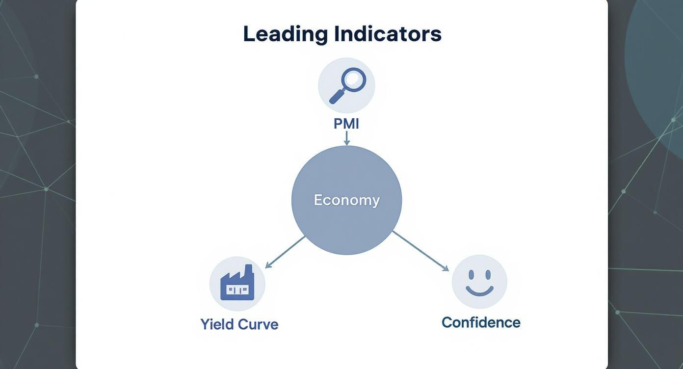
As you can see, none of these work in a vacuum. They're all different facets of a huge, complex economic machine.
Look for Trends, Not Triggers
One of the biggest mistakes investors make is freaking out over a single data release. Think about it: economic numbers get revised all the time, and one month simply doesn't make a trend.
So, instead of obsessing over whether the latest PMI reading was 51.2 when Wall Street expected 51.5, zoom out. Look at the trajectory over the last six or twelve months. Is the line generally pointing up, down, or is it just flat? A steady, multi-month decline is infinitely more important than one tiny miss.
It's like steering a giant container ship. You don't swerve for every little wave; you set your course based on the prevailing current.
Spotting Crucial Divergences
Some of the most powerful signals pop up when two indicators that should move together suddenly start going in opposite directions. This is a tell-tale sign of tension building in the economy—and often a sign that a turning point is near.
A classic example? The stock market is ripping to new highs while the yield curve is flattening or, even worse, inverting. This tells you that stock investors are partying, but the bond market—which is usually the more sober of the two—is flashing a big warning sign about future growth.
Here are a few other critical divergences to keep on your radar:
- Soaring Consumer Confidence, Falling PMI: People feel great and are swiping their credit cards, but the factories that actually make things are slowing down. This could mean that spending is being fueled by debt and won't last if the industrial economy gets weaker and people start losing jobs.
- Strong Job Growth, Declining Building Permits: The labor market looks fantastic on the surface, but fewer new construction projects are being approved. This suggests that while things are good right now, businesses are getting nervous about making big, long-term investments—a clear signal of a slowdown ahead.
Finding these divergences is where the real analytical alpha is. Learning how to read stock charts can also give you another layer of context, helping you see if the market's price action is confirming or fighting the economic story.
The goal is synthesis. By weaving together signals from multiple leading economic indicators, you can build a market outlook you can actually stand behind. You’re not just consuming data; you're becoming an analyst, building a cohesive strategy from a wide base of evidence.
A Real-World Application
Let's walk through a scenario. Over a three-month period, you notice the Consumer Confidence Index is climbing steadily, and retail sales numbers look solid. At the same time, the ISM Manufacturing PMI has slipped from 54 all the way down to 49, and new orders for durable goods have dropped for two straight months.
A surface-level glance is just confusing. Are things good or bad?
But if you dig deeper, a story emerges: consumer spending is holding up for now, but the industrial foundation of the economy is cracking. This is a classic late-cycle signal. This insight allows you to start questioning how long the market rally can last and maybe begin rotating into more defensive sectors—long before the bad manufacturing news finally trickles down into weaker employment and spooks the consumer.
Real-World Examples of Indicators Predicting Market Turns
Theory is useful, but there’s nothing like seeing leading economic indicators for stock market analysis work in the real world. History is the best teacher here, showing us how these data points were sounding the alarm while the broader market was still blissfully unaware.
When you dig into pivotal moments like the 2008 financial crisis or the dot-com implosion, you see a classic story unfold: the real economy was weakening, but stock market euphoria was running wild. These case studies make the power of leading indicators crystal clear.
The 2008 Great Financial Crisis
Long before Lehman Brothers collapsed in September 2008, the economic dashboard was flashing bright red. Even as the stock market pushed to new highs in late 2007, a few key indicators were painting a much darker picture.
- Housing Starts and Building Permits: The housing market was the canary in the coal mine. After peaking in 2005, new residential building permits went into a complete freefall through 2006 and 2007. This wasn’t a small dip; it was a sustained, steep drop signaling that the very foundation of the economy was cracking.
- The Inverted Yield Curve: Over in the bond market, the warning sirens were blaring. The yield curve briefly inverted in late 2006 and then again, more decisively, in 2007. With a nearly perfect track record for predicting recessions, this was the bond market screaming that serious trouble was on the horizon.
- Waning Consumer Confidence: As the subprime mess started to bubble to the surface, the Consumer Confidence Index began a sharp slide in mid-2007. This showed that everyday households were getting nervous about their finances, a clear foreshadowing of the spending freeze that was about to hit the economy.
Despite these flashing red lights, stocks kept climbing for months—a perfect example of how sentiment can completely disconnect from reality. Investors who were paying attention to the indicators had plenty of time to pull back and reduce risk before the crash. Understanding the history of stock market crashes really helps put these patterns into perspective.
The Dot-Com Bust of 2000-2002
The turn of the millennium was another textbook case. The late ‘90s were a speculative frenzy, but the underlying economic data started to go sour long before the bubble finally popped in March 2000.
The dominant narrative was "this time is different"—that the old rules of economics didn't apply to the new internet economy. The leading indicators, however, told a different story. They showed the fundamentals were rotting away, just as they always had before a downturn.
The Federal Reserve had started hiking interest rates in mid-1999 to cool things down. This move triggered a critical signal: the yield curve inverted in early 2000. Bond traders were betting that the Fed's actions would push the economy into a recession.
At the same time, the ISM Manufacturing PMI began to slide, eventually falling below the crucial 50 threshold. This meant the industrial side of the economy was shrinking, even while tech stocks were being valued on "eyeballs" instead of actual profits. It was a classic warning that the stock market party was dangerously detached from the health of the real economy.
The Modern Divergence
This pattern isn't just ancient history; it happens all the time. For instance, the US500 stock market index has often charged to new highs even as the underlying economic data has begun to soften. This kind of performance is common—equities get propped up by short-term momentum while the leading indicators are quietly signaling caution.
This exact split—weakening indicators versus a resilient stock market—has almost always preceded major corrections as investors eventually snap out of it and shift their focus from momentum back to fundamentals. You can see this behavior play out in real-time stock market data.
These historical examples drive home a critical lesson. The stock market is often looking in the rearview mirror, driven by emotion and momentum. By learning to read the signals from the most reliable leading economic indicators for the stock market, you can get a more objective, forward-looking view and navigate the inevitable market turns with a bit more confidence.
Don't Get Faked Out: How to Sidestep False Signals
Using leading economic indicators for stock market analysis can give you a real edge, but let's be clear: they are not crystal balls. These tools are powerful, not perfect. Relying on them blindly is a surefire way to get burned. They can, and do, produce false signals—screaming "recession!" when one never shows up, or completely missing a rally that seemingly comes out of nowhere.
The key to building a resilient strategy is understanding their limits. The single biggest mistake I see investors make is freaking out over one data point. A sudden plunge in consumer confidence or a weak PMI report can trigger a wave of panic selling. But these single-month readings are often just noise and frequently get revised later. Real insight comes from seeing the bigger picture, not reacting to a single scary headline.
The Danger of a Narrow View
Another classic trap is tunnel vision. If you’re only looking at U.S. indicators while the rest of the world is flashing warning signs, you’re missing a huge piece of the puzzle. We live in a deeply interconnected economy. A manufacturing slump in Europe or a credit crunch in Asia can send shockwaves straight to the U.S. market, even if our domestic numbers look solid on the surface.
Just as important is remembering that the first report is rarely the final word. Preliminary economic data are often just educated guesses. The "final" numbers, which can come out weeks or even months later, might tell a completely different story. An investor who dumps stocks based on a weak initial jobs report could be kicking themselves when that number is revised sharply higher.
Remember, these indicators are just one piece of the puzzle. They provide a valuable macroeconomic overlay, but they should never be the sole basis for your investment decisions. The most durable strategies combine economic analysis with deep fundamental and technical research.
Building a More Balanced Approach
To avoid getting whipsawed by false signals, you need a more disciplined and balanced process. That means looking for confirmation across several different, unrelated indicators before you make a major move in your portfolio.
Here are a few practical ways to build a stronger framework:
- Look for Convergence: A single warning sign, like a dip in the PMI, is worth noting. But when that dip is confirmed by falling building permits and a flattening yield curve? That signal becomes much more powerful and a lot harder to ignore.
- Prioritize the Trend: Don't get fixated on one month's data. Instead, step back and ask, "What has this indicator been doing for the last six months?" A consistent downward trend is infinitely more meaningful than any single reading.
- Combine with Company Fundamentals: Economic data tells you about the weather, but it doesn't tell you which ships are built to handle the storm. Always layer your macro view with a bottom-up analysis of a company's balance sheet, competitive moat, and valuation.
At the end of the day, leading indicators are tools for managing probabilities, not predicting certainties. They help you tilt the odds in your favor by offering a peek at the potential risks and opportunities on the horizon. By understanding their limitations and weaving them into a broader analytical framework, you can make smarter, more informed decisions without falling victim to the inevitable false alarms.
Building Your Own Economic Indicator Dashboard
Alright, it's time to roll up our sleeves and move from theory to practice. Understanding what these signals mean is one thing, but consistently tracking the most important leading economic indicators for the stock market is what turns that knowledge into a real-world tool.
Putting together a personal dashboard is far simpler than it sounds, and it's the absolute best way to keep these vital signs on your radar. You don't need fancy software or expensive subscriptions. The idea is just to create one simple, central spot to watch the handful of data points that truly matter, helping you spot trends before they become headlines.
Choosing Your Data Sources
The best part? All the highest-quality economic data is available for free from incredibly credible sources. You just have to know where to go. These are the same government and research institutions the pros rely on.
Your go-to list should start here:
- The Federal Reserve Economic Data (FRED): Run by the St. Louis Fed, FRED is an absolute treasure trove for investors. It's a massive, searchable database with thousands of economic data series, perfect for pulling everything from the yield curve to housing starts.
- The Conference Board: This non-profit research group is the official home of the Leading Economic Index (LEI) and the Consumer Confidence Index (CCI), two of the most critical indicators we've covered.
- The Institute for Supply Management (ISM): When you need the most reliable data on manufacturing and services, the ISM's monthly PMI reports are the gold standard.
If you’re looking for a little inspiration on how to lay everything out visually, it can be helpful to check out some business intelligence dashboard examples to get ideas.
Your Dashboard Checklist: What to Track
The key here is to avoid information overload. Start with the heavy hitters—the ones with the most reliable track record for predicting stock market moves. Your first dashboard should feature, at a minimum, the four key indicators we've already walked through. This will give you a rock-solid foundation.
The goal isn't to track every single economic release. It's to create a streamlined view of the indicators that give you the clearest signal about where the economy is heading next.
Here’s a simple checklist to get you started:
- ISM Manufacturing PMI: Watch the monthly release. Is the number trending above 50 (expansion) or below (contraction)? More importantly, what’s the trend been over the past six months?
- Consumer Confidence Index (CCI): Keep an eye on the monthly value. What you’re really looking for are sharp or sustained declines that signal growing anxiety among consumers.
- New Residential Building Permits: Check the monthly and annual trends here. This is a great gauge of long-term confidence in the economy's foundation.
- 10-Year Minus 2-Year Treasury Yield Spread: This is your yield curve monitor. You should be checking this weekly, if not more often. If it goes negative, the curve has inverted—a powerful recession warning you can’t ignore.
By pulling these few data points into a simple spreadsheet or a free data visualization tool, you’re effectively creating your own early warning system. Review it regularly, and you'll be far better equipped to navigate the economic cycles that drive the market.
Common Questions About Economic Indicators
Diving into economic data can feel like learning a new language. Let's clear up some of the most common questions investors have about using leading economic indicators for the stock market and how they fit into a smart investment strategy.
How Far in Advance Can Indicators Predict a Recession?
There's no magic number here, but leading indicators typically start flashing warning signs anywhere from 6 to 18 months before a recession is officially declared. The exact lead time really depends on the indicator you're watching.
For example, an inverted yield curve has historically given a heads-up about 12 to 18 months before U.S. recessions. The real key isn't to fixate on one signal or start a countdown timer. Instead, you want to see a consistent, confirming trend across several data points—like a drop in the LEI happening around the same time as a slump in building permits.
Leading, Lagging, and Coincident Indicators Explained
Imagine the economy is a big freight train chugging down the tracks. Each type of indicator gives you a different piece of the story about its journey:
- Leading Indicators: These are the signals far down the track, warning the conductor about a potential slowdown or stop ahead. Think of things like building permits or the yield curve, which change before the overall economy shifts gears.
- Coincident Indicators: These tell you the train's speed and location right now. Industrial production and nonfarm payrolls are perfect examples, moving in lockstep with the economic cycle.
- Lagging Indicators: These are the mile markers the train has already passed, confirming the route it took. The unemployment rate is a classic lagging indicator because it only starts to climb after the economy has already hit a rough patch.
For anyone trying to look ahead in the stock market, the focus is almost entirely on the leading indicators.
Which Single Indicator Is Most Reliable?
If you had to pick just one, the Yield Curve—specifically the spread between the 10-year and 2-year Treasury yields—has one of the most respected track records. It's about as close to a crystal ball as you can get.
An inverted yield curve has preceded every single U.S. recession in the last 50 years, giving it an unparalleled track record.
But even the best indicator shouldn't be used in a vacuum. Its signal becomes truly powerful when other key data points agree. That’s why serious analysts almost always use it alongside other heavyweights like the ISM Manufacturing PMI and The Conference Board's Leading Economic Index (LEI) to build a complete picture.
At Commons Capital, we help our clients cut through the noise by integrating this kind of deep macroeconomic analysis with personalized wealth management. To see how we can help you build a more informed financial future, visit us at our website.