Don't let a stock chart intimidate you. At its core, it's a visual story of a stock's price over a set period. Learning how to read stock charts might seem complex, but once you understand the key components, it's much simpler than it appears. This guide will walk you through the essential elements, from basic chart components to advanced technical indicators, helping you make smarter, more informed investment decisions.
The key is to master a few core components: the price axis, the time frame, and the volume bars. Getting these basics down is the first real step toward interpreting market sentiment and identifying potential opportunities.
Decoding Your First Stock Chart
Think of a stock chart as a real-time map of supply and demand. Every chart you see, no matter the platform, is built from the same fundamental elements that tell you what happened, when it happened, and how much conviction was behind the move. Understanding these stock chart basics is like learning the alphabet before you start writing sentences.
Once you get a feel for these foundational pieces, the more advanced concepts we’ll get into later will click into place. It’s a crucial building block, something we touch on in our broader guide on how to invest in stocks for beginners. Ultimately, your goal is to use this visual data to separate meaningful trends from short-term market noise.
To do that, you have to understand historical price action. For example, the US500 index climbed 0.95% from mid-October to mid-November 2025. That sounds modest. But zoom out, and you'll see it was up a whopping 14.71% compared to the same period the year before. That's the power of a chart — it gives you both the close-up view and the big-picture story.
The Core Components of a Stock Chart
Every chart you pull up will have the same building blocks. While these principles hold true for almost any asset, it's interesting to see how they're adapted across different markets. For a look at how these same ideas apply in another space, you might find an essential guide to reading crypto charts a useful point of comparison.
But for now, let's focus on the essentials for stocks. I've put together a quick table to break down the non-negotiable elements you'll find on every single stock chart.
Core Components of a Stock Chart
These three pieces — price, time, and volume — are the bedrock of chart analysis. Everything else we'll discuss builds on this foundation.
What Every Candlestick Is Telling You
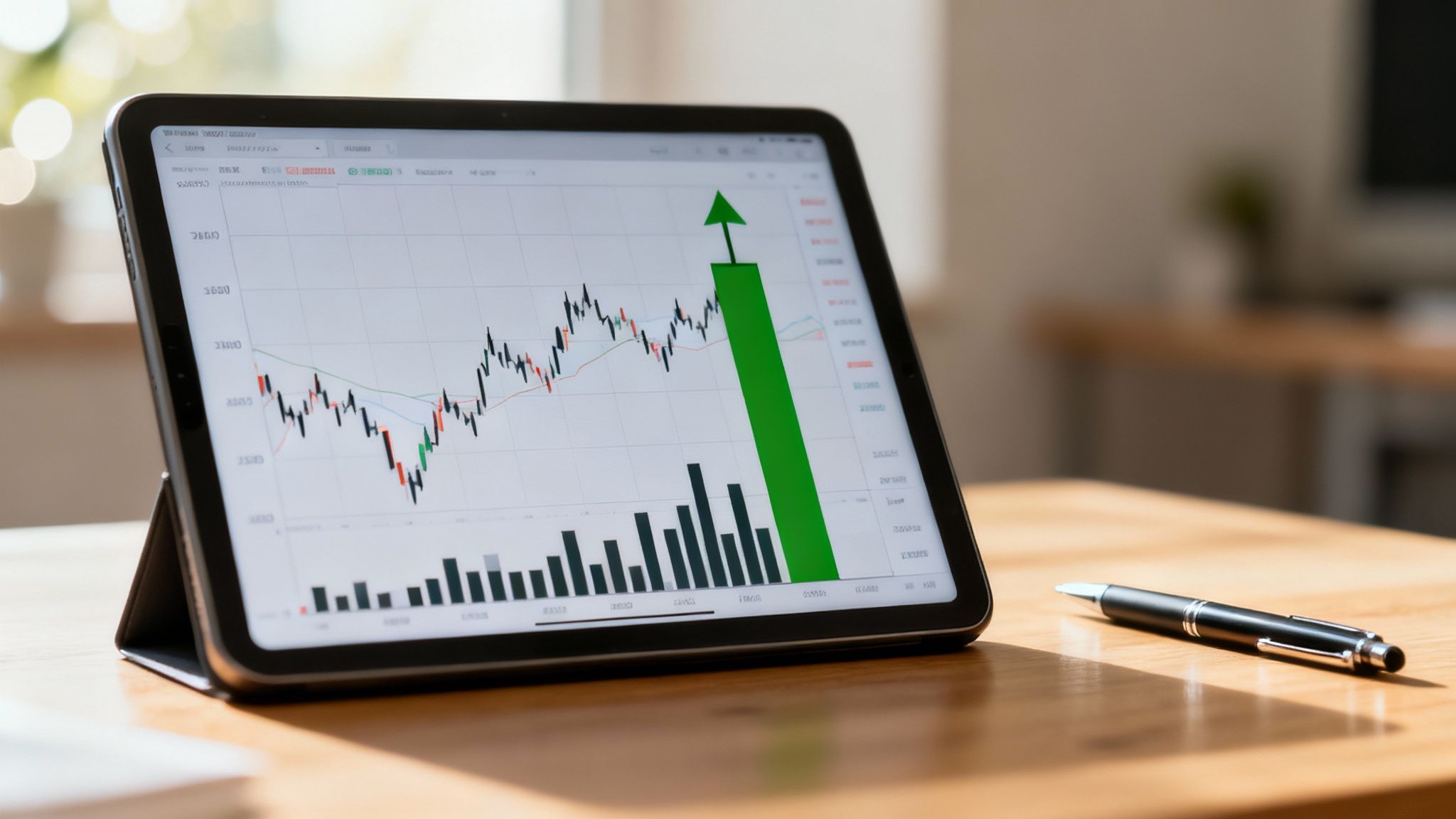
Line charts give you a bird's-eye view, but candlestick charts tell the real story behind the price. I think of each candle as a snapshot of the battle between buyers and sellers over a set period. Learning how to read stock charts properly starts here, with the language of the candles.
A single candlestick tells you four key things at a glance: the open, close, high, and low price. But more importantly, its color and shape reveal the market's sentiment during that session. You can see who won the fight — the bulls (buyers) or the bears (sellers).
This infographic maps out the core data points you’ll find on a typical stock chart.
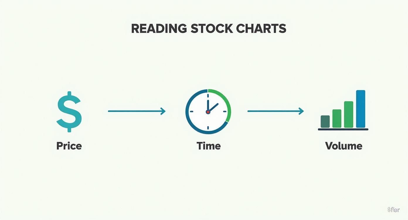
As you can see, price, time, and volume are the fundamental pillars of chart analysis. Candlestick patterns are simply the language we use to interpret them.
Decoding the Anatomy of a Candle
To really get what a candlestick is communicating, you have to understand its two main parts: the body and the wicks. It's simpler than it sounds.
- The Body: This is the thick, rectangular part. It shows the range between the opening and closing price for that period. A green body means the stock closed higher than it opened, signaling buying pressure won out. A red body means it closed lower, indicating selling pressure took control.
- The Wicks (or Shadows): These are the thin lines sticking out from the top and bottom. The top wick marks the highest price the stock hit, and the bottom wick marks the lowest. Long wicks can be a dead giveaway for volatility and uncertainty in the market.
Modern financial platforms have made it incredibly easy to access and quantify the relationship between historical stock data and current decisions. The trick is knowing that every small movement is part of a bigger picture. For example, seeing the US500 index fall to 6,734 points on November 14, 2025, losing just 0.05%, might seem insignificant. But on a chart, that single day fits into a much larger pattern. It’s why so many financial pros emphasize looking at historical financial data and statistics at FRED; it gives you the context to see how a stock is trading relative to its own history.
Common Candlestick Patterns and Their Meanings
Individual candles are useful, but when they form patterns, they offer much deeper clues about where the market might be headed next.
A long green candle appearing after a period of decline is often a powerful sign. It tells me that buyers have stepped in with force, potentially reversing the downtrend. On the flip side, a tiny candle with long wicks after a strong rally suggests indecision — the trend might be running out of gas.
Here are a few foundational patterns I always watch for:
- The Hammer: This looks like a small body at the top with a long lower wick. When it shows up after a downtrend, it can signal a bullish reversal. It means buyers stepped in during the session and pushed prices up from the lows.
- The Engulfing Candle: This is a big one. It's a large candle that completely "engulfs" the body of the one before it. A bullish engulfing pattern (a big green candle swallowing a small red one) points to very strong buying momentum.
- The Doji: You'll spot this when a candle has almost no body, meaning the open and close prices were nearly identical. This pattern screams indecision in the market and can often come right before a change in trend.
Using Volume to Confirm Price Moves
If price and candlesticks tell you what happened, think of volume as telling you how much conviction was behind the move. Those vertical bars at the bottom of your chart aren’t just decoration; they show the total number of shares that changed hands. This piece of the puzzle is absolutely critical if you want to learn how to read stock charts like a professional.
When a stock makes a big jump in price, and you see a massive spike in volume to go along with it, that’s a powerful statement. It often signals that institutional investors are buying in, and the market generally agrees on the new, higher valuation. But what if you see that same price jump on anemic, below-average volume? That's a huge red flag. It could be a "head fake" — a move that looks promising but doesn't have the real buying power to keep going.
Analyzing price and volume together gives you a much richer, more complete picture. It’s the difference between hearing a market rumor and seeing the official press release.
How Volume Confirms a Trend
A healthy, sustainable trend — whether it’s heading up or down — needs to be backed by corresponding volume. When a stock is in a solid uptrend, what I want to see is volume increasing as the price climbs higher, and then drying up on the small pullbacks. This pattern shows you that enthusiasm is growing on the way up and fading during minor rests, which tells me the primary trend is still very much alive.
The reverse is true in a downtrend. I look for volume to swell as the price falls and shrink on any relief bounces. It shows that sellers are in aggressive control and buyers just don't have the conviction to stage a real rally.
Spotting Trend Exhaustion with Volume
One of the most valuable things volume can do is warn you when a trend is getting tired and losing steam. This usually happens when price and volume start moving in opposite directions — what we call a divergence.
Let's imagine a stock has been in a strong uptrend for weeks, hitting new highs along the way. Then, it pushes to yet another new high, but this time on noticeably lower volume than the previous peaks. That's a classic divergence.
This price-volume divergence is a warning sign. While the price is still inching up, the buying pressure and participation are clearly weakening. It can mean the "smart money" is quietly selling their shares, leaving the trend vulnerable to a reversal.
Here are the two key divergence scenarios I'm always watching for:
- Bullish Divergence: The stock’s price makes a new low, but the selling volume is significantly lighter than it was on the previous low. This hints that the sellers are running out of gas.
- Bearish Divergence: The stock’s price hits a new high, but the buying volume is much weaker than it was on the last high. This is a big clue that the buyers are getting exhausted.
Recognizing these subtle shifts lets you anticipate potential changes in direction instead of just reacting after the fact.
Adding Indicators Without the Confusion
Once you have a feel for price and volume, technical indicators can act as a fantastic co-pilot for your analysis. The problem? There are literally hundreds of them, and it’s incredibly easy to fall into "analysis paralysis." Instead of cluttering your screen with a dozen squiggly lines, the key is to pick a few that you trust and truly understand what they're designed to do.
Think of them as different lenses. Some clarify the underlying trend, others measure momentum, and some try to signal when a stock’s move is getting a bit stretched. A professional approach involves using these tools to confirm what you’re already seeing in the price action, not to blindly generate buy or sell signals on their own.
Let's start with three of the most common and reliable indicators to build a solid foundation.
Seeing the Trend with Moving Averages
The simplest and one of the most effective indicators is the Moving Average (MA). Its job is to smooth out the day-to-day price noise, giving you a much clearer picture of the underlying trend. A 50-day MA, for instance, just plots the average closing price over the last 50 trading sessions.
It’s pretty straightforward. When a stock is consistently trading above its moving average, it's a strong sign of a healthy uptrend. If it’s trading below the MA, that confirms a downtrend. You’ll often hear traders talk about a "golden cross," when a shorter-term MA (like the 50-day) crosses above a longer-term one (like the 200-day), often seen as a signal that a new bull market phase could be starting.
Measuring Momentum with the RSI
The Relative Strength Index (RSI) is a momentum oscillator. It measures the speed and magnitude of recent price changes, helping you spot potentially overbought or oversold conditions on a scale from 0 to 100.
A common rule of thumb is that an RSI reading above 70 is considered "overbought," suggesting a recent rally might be due for a breather. A reading below 30 is considered "oversold," which could mean a sell-off is losing steam.
A word of caution: A strong stock can stay "overbought" for a very long time in a powerful uptrend. I find the RSI most useful for spotting divergences. For example, if the stock's price hits a new high, but the RSI makes a lower high, that’s a classic bearish divergence. It’s a subtle clue that the upward momentum is starting to fade.
Spotting Shifts with the MACD
The Moving Average Convergence Divergence (MACD) indicator might sound complicated, but it's really designed to show changes in a trend's strength, direction, and momentum. It has two key lines — the MACD line and the signal line—plus a histogram that visualizes the distance between them.
When the MACD line crosses above the signal line, it's considered a bullish signal, suggesting upward momentum is picking up. Conversely, when the MACD line drops below the signal line, it’s a bearish crossover, indicating that momentum might be shifting to the downside. These signals become particularly powerful when they confirm the primary trend you’ve already identified.
With so many indicators available, it helps to see how the most popular ones stack up against each other. Each one tells you something different about the market's psychology.
Popular Technical Indicators Compared
Ultimately, the goal isn't to find the "perfect" indicator. It's about building a small, reliable toolkit that helps you interpret price action more effectively.
Putting It All Together: A Practical Framework for Analyzing Any Chart
Knowing the individual pieces—candlesticks, volume, indicators — is one thing. But the real skill in learning how to read stock charts comes from piecing them together into a repeatable, systematic process.
Having a consistent framework is what separates disciplined analysis from emotional guesswork. It’s about building a structured routine you can fall back on every single time you pull up a chart, ensuring you don’t get distracted by noise or miss a critical signal. This isn’t some secret formula. It's simply a disciplined approach to interpretation — the difference between randomly pointing out landmarks on a map versus actually using a compass to navigate.
My Four-Step Analysis Process
To bring it all together, I lean on a simple, four-step checklist. This approach forces me to look at the chart from multiple angles, starting with the big picture and then drilling down into the finer details.
Here’s the exact order of operations I follow:
- Identify the Primary Trend: Before I do anything else, I zoom out. Is the stock in a clear uptrend (a series of higher highs and higher lows)? A downtrend (lower highs and lower lows)? Or is it just chopping around in a sideways range? This macro view is everything; it sets the context for all the analysis that follows.
- Examine Recent Price Action: Now, I zoom in on the most recent candles. Am I seeing powerful bullish patterns, like an Engulfing candle, or signs that the conviction is fading, like a Doji? The latest candles tell you about the market’s current psychology.
- Check Volume for Confirmation: Next, I look at the volume bars that correspond with that recent price action. If there's a breakout, is it backed by a surge in volume? That confirms conviction. Or is a rally happening on thin, weak volume, suggesting it could fizzle out? This step either validates or calls into question what the price is telling you.
- Consult Your Indicators: Finally, I glance at my chosen indicators (like RSI or MACD) to see if they back up my read. Are they confirming the trend, or are they flashing a divergence that warns of a potential reversal? Indicators should always be the last step — used for confirmation, not discovery.
This methodical sequence ensures my decisions are based on a confluence of evidence, not just a single, isolated signal. It's a vital step in spotting truly sustainable growth in stocks and avoiding head-fakes.
Putting the Framework into Practice
Let's walk through a quick, real-world scenario. Imagine we're looking at a chart of Company XYZ.
First, we zoom out to the daily chart. We can see it's been making a series of higher lows for the past three months — it's in a confirmed uptrend. That’s our context.
Next, we zoom in. We notice the stock just broke above a key resistance level with a large, decisive green candle. The price action is clearly bullish.
But here’s the crucial third step: checking the volume. A quick glance at the bottom of the chart shows that the breakout occurred on the highest volume seen in over a month. This is a powerful signal that institutional buyers are likely stepping in.
Finally, we look at our indicators. The RSI has moved above 60 but isn't yet overbought, which suggests there’s still room to run. The MACD has just made a bullish crossover. In this case, all four steps align perfectly, painting a clear and coherent picture.
Answering Your Top Questions on Reading Stock Charts
Once you start putting these concepts into practice, you’ll inevitably run into a few questions. Getting the hang of how to read stock charts is a process, and a few common sticking points pop up for everyone.
Let's walk through some of the most frequent questions I hear. Clearing these up will help bridge the gap between theory and real-world application, giving you a much clearer lens through which to view the market.
What’s the Best Time Frame to Use?
This is a classic question, and the honest answer is: it completely depends on your investment style. There is no single "best" time frame; there’s only the one that aligns with your specific goals.
- Day traders live on the 1-minute or 5-minute charts. They need to see every tick and flicker to make split-second decisions based on intraday swings.
- Swing traders, who might hold a position for a few days or a couple of weeks, tend to favor daily and 4-hour charts. These time frames are perfect for catching those medium-term market waves.
- Long-term investors — and this is where many of our clients sit — gravitate toward weekly or even monthly charts. This approach helps filter out the distracting daily noise and focus on the major, overarching trends that drive wealth over years, not days.
A really effective technique is to use multiple time frames together. I often look at a weekly chart to confirm a stock is in a solid, primary uptrend, then zoom into the daily chart to find a good entry point during a minor pullback. It’s about seeing both the forest and the trees.
How Reliable Are Technical Indicators, Really?
Think of technical indicators as confirmation tools, not as crystal balls. Their real power comes from supporting what you're already seeing in the price action and volume — they should never be the only reason you buy or sell.
The truth is, no single indicator is 100% accurate. They’re notorious for giving false signals, especially when the market is chopping sideways without a clear direction. You might see an RSI reading that’s screaming "oversold," suggesting a stock is a bargain. But if there’s a powerful underlying reason people are selling, that price can — and often will—keep right on falling.
Our advice? Stick to a few complementary indicators. Maybe use one to gauge the trend and another to measure momentum. This creates a much more robust system of checks and balances for your decisions.
Can You Just Read Charts and Ignore Fundamentals?
Technically, yes. This is the entire philosophy behind pure technical analysis. A hardcore technician believes that all known information — from earnings reports to industry news — is already baked into the stock's price. So, by analyzing the chart, you're essentially analyzing the market's collective wisdom.
But in my experience, the most successful investors rarely live in just one camp. A hybrid approach is almost always the most effective. Use fundamental analysis to find what to buy — a great company with a durable competitive advantage. Then, use technical analysis to decide when to buy it — at a moment when the market sentiment and price action are in your favor. If you're just starting out and want a thorough primer, this guide on How to Read Stock Charts for Beginners is an excellent resource.
At Commons Capital, we help our clients navigate these complexities, integrating sophisticated chart analysis with deep fundamental research to build robust investment strategies. Contact us today to learn how we can help you achieve your financial goals.